240Tutoring
Overview
240Tutoring is a leading teacher certification preparation platform dedicated to helping aspiring educators succeed. We redesigned key website experiences with a focus on usability, modern aesthetics, and clear content hierarchy, creating a seamless and engaging journey for future teachers.

Design Process
Every project starts with a good brief, and this one was no different. We sat down with the 240Tutoring team to really get what they needed, then dove into research to understand their users and where the old design was falling short. From there, it was all about exploring: sketching out ideas, iterating, throwing things at the wall to see what stuck. We looped the client in often for feedback (because let's be honest, no design is ever perfect on the first try), and along the way we also took the chance to refresh their old design system into something more current. Then we'd go back, tweak, review again, and repeat the whole cycle until everything just clicked.
The Challange
Like most redesigns, this one came with its fair share of hurdles. One of the trickiest parts was making sure everything still felt consistent with the old design system while we were building out v.2, since we didn't want users to feel a jarring disconnect. On top of that, we wanted to give 240Tutoring a fresh, modern look without sacrificing the experience users already knew, so the challenge was balancing "new and exciting" with "familiar and easy to use," making sure the upgraded interface actually felt like an upgrade, not just a facelift. And through it all, keeping the audience engaged was key. From cheatsheets to logos, every visual piece needed to feel cohesive and fresh, while still pulling people in and keeping their attention on the content that mattered most.
The Solution
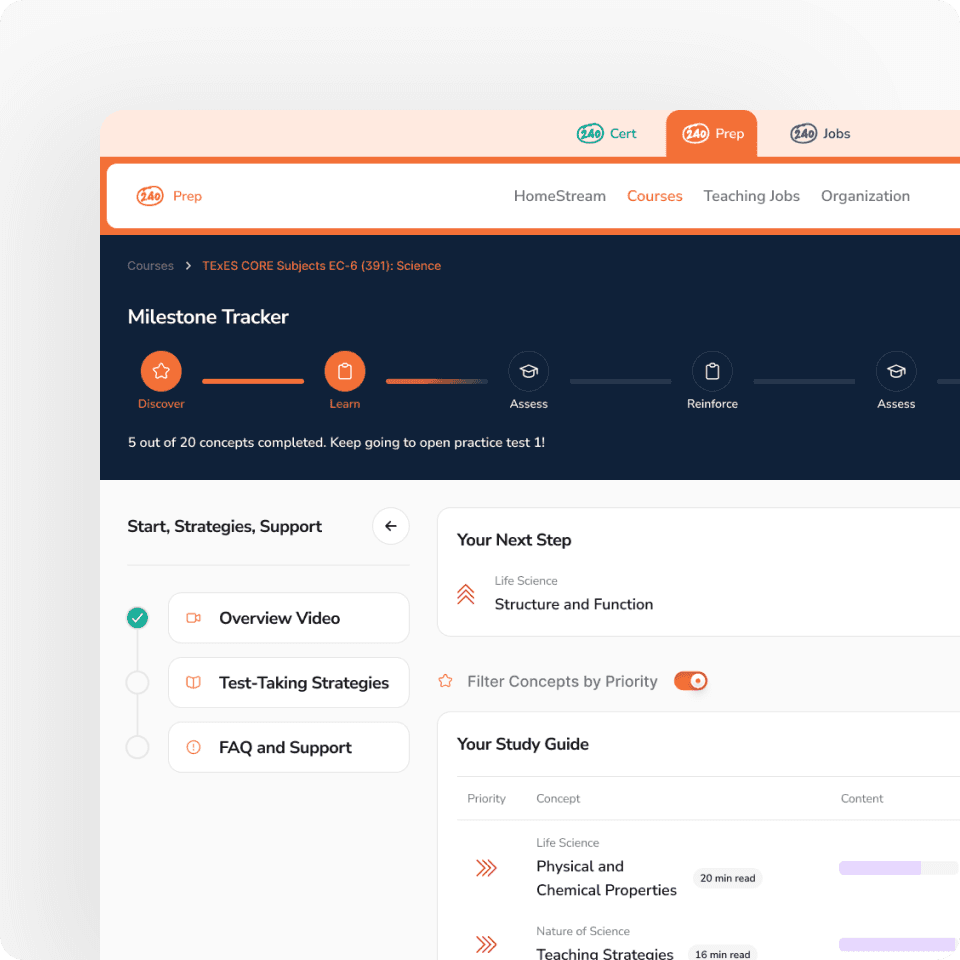
In the end, we landed on a design that bridged the gap between old and new without losing what users already trusted. The v.2 design system kept core elements consistent while giving everything a cleaner, more modern feel, so the transition felt natural instead of jarring. On the UI/UX side, we refined the interface with better navigation and clearer visual hierarchy, making the experience feel fresh while still familiar enough that users didn't have to relearn anything from scratch. For the graphic design, we gave the cheatsheets, logos, and supporting visuals a cohesive, engaging look that pulled the whole brand together, keeping the audience hooked and coming back for more.